
Tuesday, 25 December 2012
Wednesday, 28 November 2012
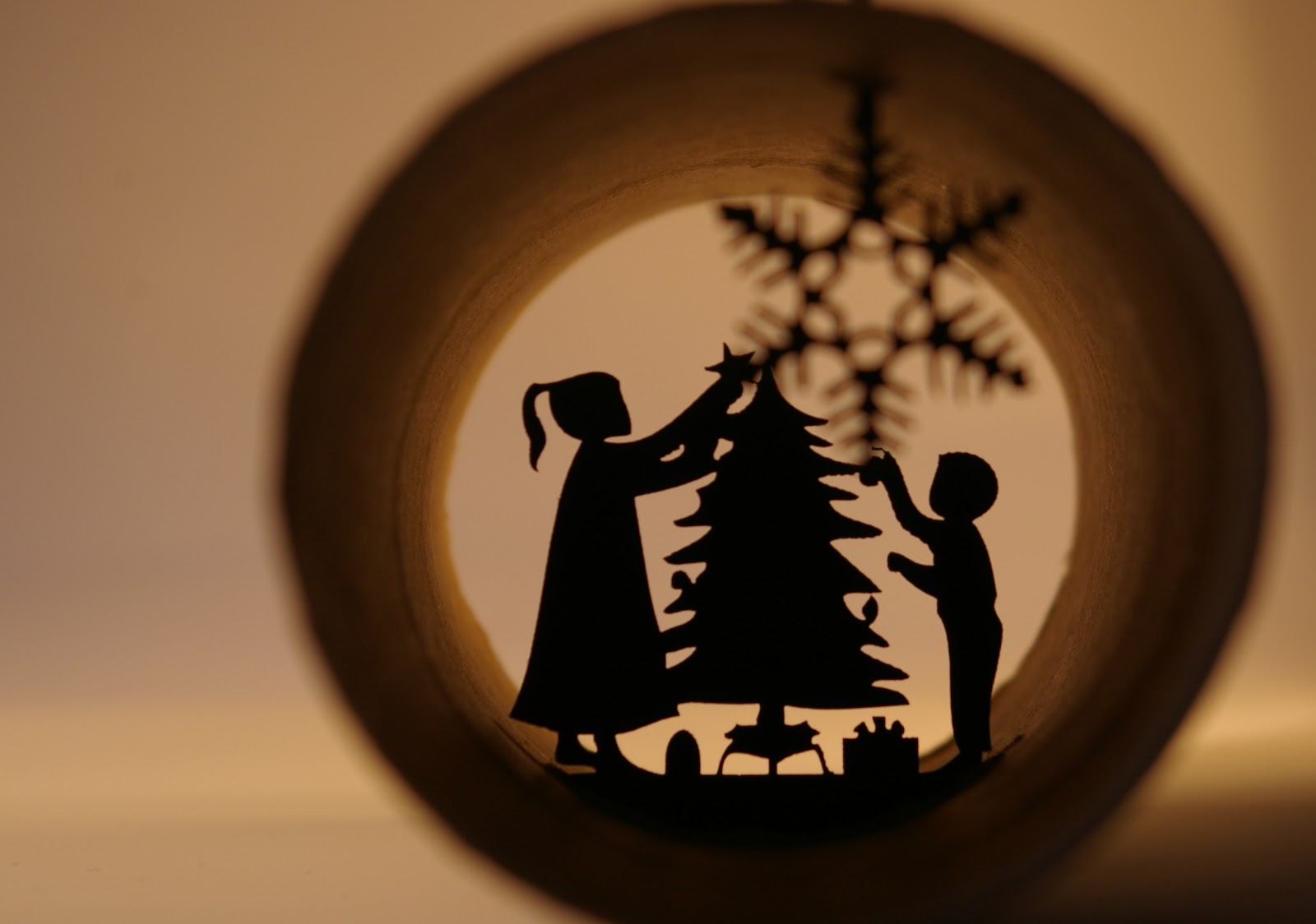
Update to silhouettes
New versions of the silhouettes in toilet rolls. the last one being shot outside in a moment of sunshine today. I am liking the effect of natural light, so will have to choose my moments to try and get more of these. The shadows seem to give added movement to the figures.


Wednesday, 14 November 2012
Tuesday, 6 November 2012
Saturday, 3 November 2012


Movember
Ok, so having a go at this mobro thing. Yes I am going to grow a moustache over the month of November. I am three days in and happy with progress so far. My boys not so happy. Please feel free to donate for this great cause and for me to be able to embarrass my sons further.
mobro.co/chrisvenables
Day 3

mobro.co/chrisvenables
Day 3

Tuesday, 9 October 2012
Brian Grimwood: The Man Who Changed the Look of British Illustration.

WORK is hosting a comprehensive retrospective of Brian Grimwood's career to date. The exhibition includes archival drawings, paintings, cover artwork, newspaper illustrations and printed ephemera, alongside more recent work by the renowned British illustrator.
Grimwood's free and fluid style first characterised the visual culture of the 1960s in iconic images such as those created for the influential magazine Nova.
His designs have since become synonymous with British and Western popular culture and advertising, as evinced by his covers and brand identities for high-profile companies including Faber & Faber, BBC Proms, WH Smith and Johnny Walker.
Grimwood was also one of the first illustrators to enthusiastically embrace the then new computer illustration programs, while at the same time employing traditional artistic methods and materials. His fascination with new technologies continues today, as demonstrated by his recent work using Photoshop and the iPad.
As founding director of the Central Illustration Agency (CIA), Grimwood has also been pivotal in the promotion of the work of a host of illustrators from around the world, including Sir Peter Blake, Jeff Fisher and David Hughes from among the 80 or so illustrators on CIA's books.
Brian Grimwood: The Man Who Changed the Look of British Illustration explores Grimwood's prolific and wide-ranging output through a diverse selection of drawings, paintings, cover artwork, newspaper illustrations and printed ephemera, alongside more recent work including digital prints that reflect how his style continues to evolve.
Monday, 8 October 2012
christmas card?
A prelude to what my christmas cards may look like this year! These are still low res and with no depth of field yet, but I am beginning to understand the work involved in producing one of these. I have also been running other ideas through to move the idea on. More to follow.


Sunday, 7 October 2012


Saturday, 6 October 2012
National poetry day
My exhibition piece for the national poetry day in Bath. If you are easily offended please do not read, Charles Bukowski does not hold back.


Thursday, 13 September 2012
Wednesday, 22 August 2012
New Corporate Identity


Tuesday, 5 June 2012
legopress animated
A little more playing. Taking the printed image, filtering it in photoshop and then animating it.
Monday, 21 May 2012
Prints (legopress)
As promised, some of my prints made with lego pieces. They where produced on a roller press. Shall we call it legopress printing? I can now move on with other man hole cover patterns to produce a set for showing. More can be seen on my folio site, http://CreativeAdventures.foliohd.com/.


Thursday, 17 May 2012
Pictograms, Ideograms, Icons & Logos

Have you heard the one about the pictogram, the ideogram, the icon and the logo? They all appeared on a sign together and everybody was lost, insulted and confused!
What makes pictograms, ideograms, icons or logos so effective can also be their undoing, resulting in unconvincing messages when applied carelessly. If the image being portrayed is unrecognisable or ambiguous, the viewer will be confused at the least, but if culturally insensitive or misleading could result in offence or unpleasant misinterpretation.
Determining what the differences are between the four can be a significant start with a view to avoiding their misuse and deciding how and where to use them, while identifying what images are most effective.
Pictogram – Pictorial representation of an object, place or item.
Icon – Image or statue of symbolic nature, sometimes with significant special or religious connotations.
Ideogram – Character or representation of an idea without expressing the sounds or letters in its name.
Logo – Badge or pictorial representation depicting a specific organisation or company.
The use of pictorial representations as a means of communication is not new. Indeed, it is almost as old as man, evident from prehistoric and stone-age cave drawings, Egyptian hieroglyphs right through to modern day signage and digital technology.
Good images should be literal and easy to understand no matter what the language or cultural differences. Often pictograms and ideograms are combined to form simple instructions or messages. For example, a cigarette pictogram within a red circle and a red line through is universally understood as ‘No Smoking’. Similarly, an image of a running man with an arrow will be interpreted as the direction to follow for the ‘Emergency Exit’ and so on, the list of recognisable examples is exhaustive.
What these images have in common is, when viewed in context with their respective surroundings or in keeping with their subject matter, they are easily understood. However a tumble dry symbol on a directional sign in the local train station would not necessarily be recognised as such because it is being viewed out with its context and would therefore undoubtedly create confusion.
For identification of successful images, there are standardised pictograms defined in the International Standard ISO 7001:2007. This was created following extensive testing and research in different countries and cultures and incorporates the pictogram conventions widely known and understood worldwide.
Due to the vast array of both traditional and digital communication tools available, difficulties can often arise when attempting to communicate something new, extraordinary or inventive. As a result, there is a wide diversification of less familiar icons, pictograms and ideograms in use. Coupled with that, new messages or concepts often require additional pictogram / ideogram designs to convey a particular message, therefore, when there is no standardised image available, a few simple guidelines may be worth consideration.
Keep it simple – Represent one message only. Attempting to incorporate multiple ideas creates more confusion.
Minimise colour – Multiple colours can be unclear or untidy. When possible use only one or two colours.
Clean and clear - Use simple easily identifiable shapes to portray the message.
Context – Keep within context of subject or surroundings.
Sensitive – Be aware of cultural difference and avoid images that could create offence in some instances.
Finally, if in doubt refer to and utilise the International Standards, this will vastly increase the chance of being understood – a much more preferable outcome than being responsible for an international incident!
Saturday, 12 May 2012
Printing with Lego
Have been busy with lecturing over the past few weeks so not much blogging being done. Went to the Stephan Sagmeister talk at the Cheltenham Design Festival a couple of weeks ago, very inspiring, look out for my poor attempts at similar work over the summer.
Over this week I have been working on some print work using lego tiles to create the patterns found on man hole covers. the pics below show the cover chosen for the first go, the actual lego template and the first few pulls with ink.


Over this week I have been working on some print work using lego tiles to create the patterns found on man hole covers. the pics below show the cover chosen for the first go, the actual lego template and the first few pulls with ink.


Saturday, 14 April 2012
When Typography Speaks Louder Than Words
Clever graphic designers love to use typography to explore the interaction between the look of type and what type actually says. In communicating a message, a balance has to be achieved between the visual and the verbal aspects of a design.
Sometimes, however, designers explore the visual aspect of type to a much greater extent than the verbal. In these cases, the visual language does all the talking. This article explores when the visual elements of typography speak louder than words.
Cal Swan, author of Language and Typography, makes this point well when he says, “These two distinct areas often come together in practice as there is clearly a very strong relationship between the conception of the words as a message and their transmission in visible form.”
To avoid any misunderstanding, let’s clarify what the terms “visual language” and “verbal language” mean. In professional graphic design, visual language refers to the meanings created by the visual appearance of both text and image. In this article, the term “visual language” refers to the character and significance created by carefully selected typography. Verbal language is the literal meaning of words, phrases and sentences.
In this first of a two-part series, we will look at the powerful effect that typography has in taking control of meaning. We will discuss a range of examples, from verbal language that inspires and shapes visual treatment to visual language that dominates verbal meaning. The implications of typographic choices in meaning and interpretation will also be examined. And we will show how the same message can be presented in a number of ways to convey and encourage a diversity of responses.
We all have different cultural backgrounds and experiences that affect our perception of type one way or another. So, regardless of the designer’s skill and effort, a number of uncontrollable aspects remain, including the viewer’s perception, expectations, knowledge, experiences and preferences. And while accounting for all such unpredictable responses to type is impossible, awareness is critical.
For starters, let’s look at an interesting piece from an ad campaign by Greenpeace:

The name style from Greenpeace’s campaign to raise awareness of the impact of deforestation.
In this ad, you are confronted with the familiar name style of one of the world’s favorite chocolate bars, the Kit Kat. The type style and letterform proportions and certainly the color, shape and angle all create an instantly recognizable connection with the Kit Kat brand — so much so that you would be forgiven for seeing the name Kit Kat before reading and taking in the actual written message. Your familiarity with the brand is an instant draw, and appreciating the change of message might take you a second look.
Manipulating Feelings and Reactions
The visual language established when designing with type can bring into play not only emotions, but also physical responses. The following examples are simple illustrations of the varied and emotive effects and highly dominant control that can be achieved by changing the visual language of a message, while still presenting the same verbal language.
This first of a pair of illustrations shows a single large bold word, set in lowercase and closely kerned. The positioning in the frame makes the word dominant and loud, and the message comes across as enthusiastic, friendly and confident. The person speaking is pleased to see you and is coming towards you with a big smile on their face.

The second illustration contrasts dramatically with the first, despite featuring the exact same greeting. The font, case, scale, color and positioning all suggest a considerably more distant and hesitant meeting. In fact, you would be forgiven for thinking that the person speaking here is not at all sure they even want to acknowledge you and would have preferred to ignore you completely.

Reading these examples aloud helps us instantly appreciate the different effects of visual language. If you read the first example out loud, it would be a loud enthusiastic call that exudes genuine delight, friendliness and openness. Reading aloud the second example, the exact same word, it would be delivered in a much quieter tone, an almost hesitant voice, lacking the assurance and delight of the first. There is an infinite range of typographic alternatives that achieve subtle or dramatic changes in volume and tone of voice.
Making The Most Of Visual Language
Verbal language is often used to inspire and shape design and typography in order to get a message across, with the goal being to make the most of the viewer’s reaction. Carefully mixing a design’s implication with literal meaning can lead to a memorable outcome. The following designs are great examples of the effects that can be achieved by employing verbal language that has helped to inspire a visual treatment.
Our first illustration is taken from the work of renowned American graphic designer Herb Lubalin, who was described in a monograph about him by Gertrude Snyder and Alan Peckolick as being “a tenacious typographer, whose graphic concept employed copy, art and typography, and he used available production methods to underline the drama inherent in the message. Idea preceded design.”
Given the subject of this article, this quote is especially fitting. It shows Lubalin as a designer who valued the combined communicative power of language, typography and composition. The book goes on to explain that he used production methods not just for effect but also as a way to emphasize the meaning and message of a project. In Lubalin’s time, these decisions would have entailed manual labor, posing greater limitations than we face today. Finally, this quote confirms that, for Lubalin, concept was of paramount importance and always came before design.
One of his many entries in the Visual Graphics Corporation’s 1964 competition features a carefully selected quote by US editor and writer Caskie Stinnett.

One of Lubalin’s many typographically expressive designs that have become iconic and inspiring to generations of graphic designers. (Image: Peter Gabor)
Using delicate and well-considered composition of typographic detailing, Lubalin has succeeded in making an unpleasant message seem attractive and pleasing. The quote states “A diplomat is a person who can tell you to go to hell in such a way that you actually look forward to the trip.” The focal point of this statement, being told to “go to hell,” is shown in an elaborate and elegant calligraphic form, enabling this mildly offensive statement to be mistaken for something that could be looked forward to with great anticipation at first sight.
The work of hand-lettering designer Alison Carmichael provides a range of current examples that beautifully illustrate the powerful effect of typography when it takes control of meaning. One such design is her award-winning self-promotional ad for the Creative Circle. Carmichael’s hand-lettering is engraved and inked in an elaborate style on the lid of an old school desk. At first sight, we seem to be looking at a beautiful, possibly historic, work of gothic lettering; seconds later, reality strikes and the rather unpleasant meaning of the text becomes clear.

Award-winning self-promotional ad by Alison Carmichael for the Creative Circle.
Type Tarts is a UK initiative established to raise awareness of the plight of workers trafficked into the sex industry. Contributing designers are asked to send type-oriented “Tart cards” for exhibition. Many London prostitutes advertise their services by displaying promotional cards in phone boxes. Even in the age of the Internet and mobile phones and in the face of police crackdowns, these cards have achieved a cult following, being highly praised and collected as art.
Both examples below use expressive typefaces and type manipulation to visually reinforce the meanings of the provocative text. In the context of the campaign, figuring out the meaning of the cards is easy enough.

“Nice and Tight” by Duncan Bancroft

“Big and Bouncy” by Peter Fletcher
Another stunning example of the visual language of type is by American designer Jason Munn, well known for his highly acclaimed music posters. This example for Liars is mainly typographic, with sections of each letter cleverly removed so that the viewer doesn’t get the full picture. What is the truth? The choice of typeface is also significant; its extreme contrasts of thick and thin strokes point to the contrast between truth and lies.

Jason Munn’s poster for the US band Liars
The designs above use type to reinforce the meaning of their statements. Meanwhile, the British Battleaxe Collection’s visuals for a proposed range of type-based tea towels feature quotes from strong UK female comedy characters. These designs are doing something slightly different; type is used primarily to reinforce the agenda and assertive tone of the speakers.

British Battleaxe typographic tea towel design, inspired by the voice of the lead character in the BBC sitcom Keeping Up Appearances. (Credit: Bright Pink Communication Design)
The example above features a quote from the BBC sitcom Keeping Up Appearances. The words themselves are spoken by the program’s main character — the eccentric, social-climbing and bossy Hyacinth Bucket, a lady in her 60s with grand aspirations. Typographically, the letterforms have been selected and grouped to emphasize the desires of the character. The words “I want” and “my” stand out because of a dramatic change of scale. “Superiors” is emphasized with capital letters, whereas “your” is reduced in size and given lowercase letters, thus downgrading the importance of whom she is talking to, in keeping with the character’s bossy nature and tone of voice when speaking to her milkman.
In this design, the typeface has been dictated by the character’s tone of voice. The serif typeface with its stylish italics and capital letters captures the meaning and cultural context of this statement from a “woman of a certain age.”
Typography is used to communicate tone of voice, personality, age, gender and mood, and it can be easily manipulated. If, instead of this serif font that so successfully represents this woman’s personality, we used a slab serif, suddenly the character changes, as does the emotional impact of the statement. Judging simply by the font, the narrator is no longer definitively female; she is no longer in their mid-60s, and her mood is not merely pompous, but could be described as verging on angry. It’s a great example of how quickly the tone can shift with a simple change of typeface.

A different typographic treatment of this tea towel clearly manipulates the tone of voice and possibly even changes the gender of the speaker. (Credit: Bright Pink Communication Design)
The Power Of Typography Cannot Be Underestimated
All the examples discussed in this article demonstrate that typographic treatment works alongside verbal language to create, enhance and alter meaning. While the aesthetic value of design is always important, the significance of type in influencing meaning should not be underestimated.
The role — and, in fact, the obligation — of the designer in establishing a tone that adds meaning to the verbal message is a matter of regular debate. Many graphic designers and academics argue that the designer has a responsibility to add “flavor” to their work, not only helping to convey and enhance meaning, but also making the message enjoyable and encouraging to “read” and also memorable.
In the second part of this article, we’ll continue looking at the relationship between visual and verbal language. We’ll touch briefly on the structure and semiotics of language, as well as showcase some remarkable examples, all helping to explain why subtle typographic changes make all the difference.
Sunday, 1 April 2012
How to get and idea.
"When you get a job – say an ad for a drycleaner – many images come to mind, we all have preconceptions," Gill said. "My suggestion is to forget every image that comes to mind, forget everything you know about drycleaning.
"Instead of sitting at your computer, and looking at books, go to a drycleaner, and sit there. The way to get an interesting idea is to go to the source. Stay there until you have thought of something interesting about drycleaning. Then, listen to that idea and it will design itself."
Eric Gill
Monday, 12 March 2012
Find out who is designing the future on 20, 21 and 22 April 2012
Taking place over three days in April 2012, the inaugural Cheltenham Design Festival will showcase some of the most innovative and creative thinkers operating on a global level today. Click here to see the great names we’ve confirmed for the 2012 festival.
From 20-22 April the Parabola Arts Centre in Cheltenham will host 26 events – a series of debates, discussions and interviews – featuring leading figures in the design world. Covering all design disciplines, it’s an opportunity to engage with innovators from the world’s creative community, people who influence our lives through original thought in areas such as education, engineering and business as well as technology, wellbeing and architecture. The Cheltenham Design Festival will show how important the role creative thinking plays not only to our daily lives but also in assuring our future.
To download a PDF of the full festival programme click here or to browse the events and book tickets click here
Click here to find out more about getting to Cheltenham
Sir John Hegarty, founding partner of Bartle Bogle Hegarty, is the president of the 2012 Cheltenham Design Festival. A trailblazer in the advertising world for six decades, he is the recipient of the D&AD President’s Award, a CLIO Lifetime Achievement Award and has been inducted into both the New York Art Directors Club and The One Club Halls of Fame.
The Cheltenham Design Festival is also supported by Julian Dunkerton, the founder of SuperDry clothing brand and global retailer SuperGroup.

Saturday, 18 February 2012
Finished
A very long time after I started this piece of work, and now I have finished it, or at least as much as I need to to make the creative point. The first paragraph of "The Library of Babel" converted to braille and then to music. This is only the first six minutes of the final piece because of the size of the document. I hope you find it irritating to listen to, this is after all the aim of the piece.
Monday, 6 February 2012
The Persistence of Collage Exhibition at The Lightbox, Woking.

http://www.thelightbox.org.uk/
Date: 18 January – 25 March 2012.
Location: The Lightbox, Chobham Road, Woking, Surrey, GU21 4AA.
Price: Free Entry. Donations Welcome.
This ground-breaking exhibition traces the use of collage in British art and brings together famous British artists who have used the medium. With Ben Nicholson, Eduardo Paolozzi, Richard Hamilton, Patrick Caulfield, Chris Ofili and Grayson Perry featured alongside other contemporary artists, this exciting exhibition presents a vast range of works using different media. This newly formed touring exhibition has been developed by the Arts Council Collection.

Subscribe to:
Posts (Atom)