Thursday, 20 October 2011

A Visual Guide to the Ampersand (Infographic)
The ampersand symbol (&) has a long and rich history, dating as far back as 63 B.C. To this day, its use can be witnessed in a wide range of situations, from being a key component in a Fortune 500 company’s logo/brand identity materials to casual SMS/text messages between old friends.

Tuesday, 18 October 2011
New British Gas logo: a sign of the future?

British Gas has a new identity, which will be rolled out in full between now and January. Interestingly, it has been designed by an advertising agency: CHI & Partners, who also look after the energy company's ad work.
The new logo is an updated version of the previous British Gas logo, which has been in use for the past 17 years.
The flame from the previous logo has been replaced in CHI's new mark with a more abstract shape, that is in part green, perhaps in an effort to reflect a more environmentally conscious outlook by the company.
Do read the comments on the Creative Review blog, some interesting stuff. Feel free to make your own either here or on CR blog.
Ken Dumps Barbie, Leading Mattel To Rethink Its Rainforest Relationship
Greenpeace's successful campaign to get the toy company to change its packaging has lessons for future plans to target large companies to improve their behavior: Amp up the humor and go viral.
Sometimes it takes humor to make a serious point. That seems to be the lesson from Greenpeace’s “Barbie, It’s Over” campaign--which recently resulted in Mattel overturning how it packages its products, including its famous Barbie and Ken dolls.
This summer, Greenpeace created a video showing Ken dumping Barbie (“I don't date girls who are into deforestation”), a mock Twitter feud, photos of Barbie chainsawing logs, and a huge banner on the wall of Mattel’s L.A. headquarters. It was hoping to draw attention to the toy industry’s use of paper from the Indonesian rainforest in its packaging, and it succeeded. The video, photos, and tweets went viral, leading 500,000 people to send emails to Mattel in protest, and the media to report the story extensively.
Sunday, 16 October 2011

Friday, 14 October 2011
Creative MindMaps
Mind maps are, by definition, a graphical method of taking notes. Their visual basis helps one to distinguish words or ideas, often with colors and symbols. They generally take a hierarchical or tree branch format, with ideas branching into their subsections. Mind maps allow for greater creativity when recording ideas and information, as well as allowing the note-taker to associate words with visual representations. Mind maps differ from concept maps in that mind maps focus on only one word or idea, whereas concept maps connect multiple words or ideas.
Here are a few mind maps I have come across that I think give a good visual starting point for what is required when you are asked for a "creative mind map". The final outcome is up to you, your style or the subject in hand.


Wednesday, 12 October 2011
Has Design Education Lost It's Way?
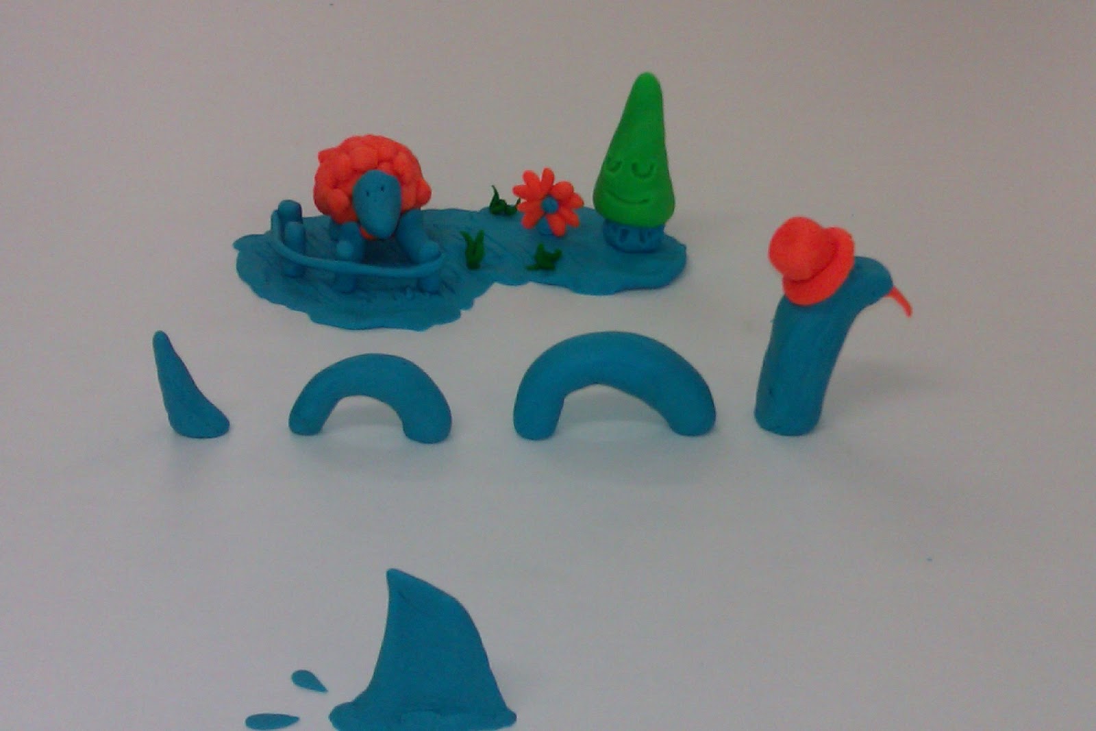
Design education seems to have lost it's way after 3rd year BA graphic design students have been seen using Play Doh during a crit/tutorial session at Southampton Solent University. Is this creativity gone mad?
In his defence, lecturer Chris Venables was heard to mutter the word neoteny as he was led away by men in white coats.
Examples of this frankly risky behaviour can be seen below, though those of a less creative outlook should look away!
Unfortunately all Crit Creations where harmed, not in the making, but when being stuffed back into there tubs.


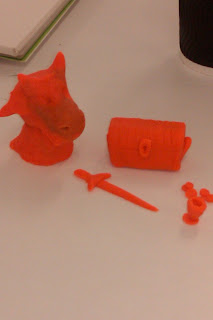


In his defence, lecturer Chris Venables was heard to mutter the word neoteny as he was led away by men in white coats.
Examples of this frankly risky behaviour can be seen below, though those of a less creative outlook should look away!
Unfortunately all Crit Creations where harmed, not in the making, but when being stuffed back into there tubs.




Subscribe to:
Posts (Atom)